Ed Hawkins is a university professor in the UK that spends his days studying climate science. He has published widely on the overturning circulation in the North Atlantic Ocean, trends for sea ice in the Arctic, and how to predict future temperatures. He’s now famous for something quite different though.
Hawkins created a gif that is changing how people think about climate change. It has been retweeted over 15,000 times and Washington Post reporter Jason Samenow called it the “most compelling global warming visualization ever made”. In short, he used an environmental big data set to create an easily understood visualization.
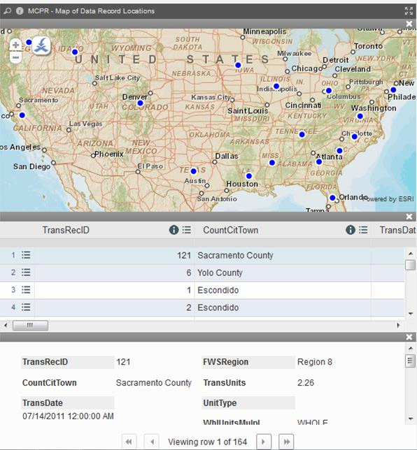
That is something EcoBlu Analyst subscribes have done for years. A user-friendly interface delivered via an affordable subscription allows both expert and novice environmental professionals alike to harness the power of big data. Users can now easily transform complex data sets into powerful graphs, charts, and maps to communicate complex concepts with clients, funders, or regulators.
If your environmental big data visualizations aren’t worth a thousand words, you’re using the wrong big data tools.
.
big data, ecoblu analyst, Ed Hawkins, environmental, technology
WASHINGTON, DC – January 15, 2024, The National Environmental Banking Association and EcoBlu Analyst™ announce the release of a viewable/downloadable GIS ArcGIS layer of U.S. Mitigation and Conservation Banks, locations, contacts and more for the community of Esri users. This collection of geographic information and associated maps, apps, and data layers are additional resources for
Read More
With government agencies and private companies adding vast amounts of routinely-isolated data in unrelated databases and still churning paper reports every day – databases, spreadsheets, and reports now exist in different formats, on different servers, and each with their own metadata and codes. Gathering and analyzing this data has become so expensive and time consuming
Read More